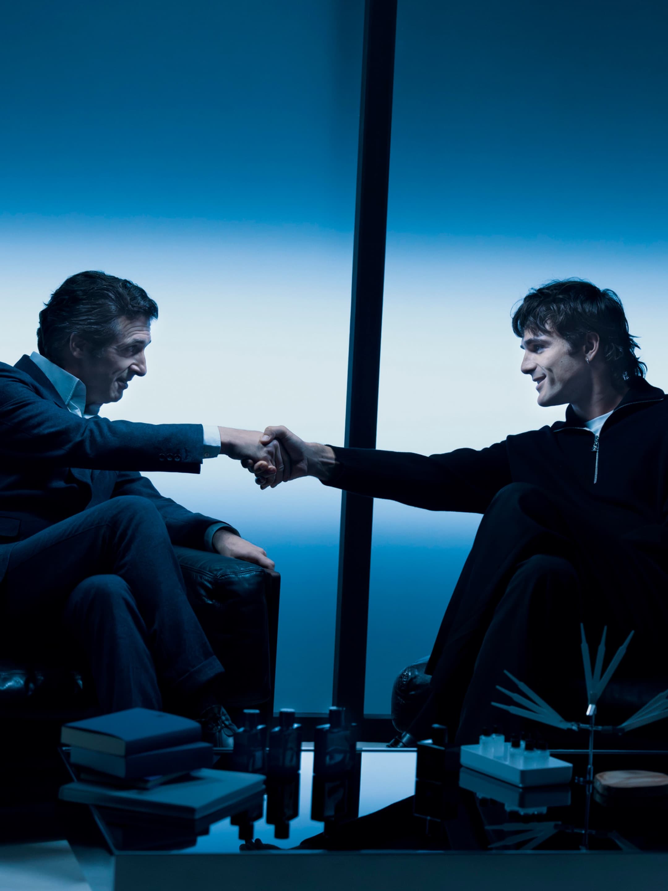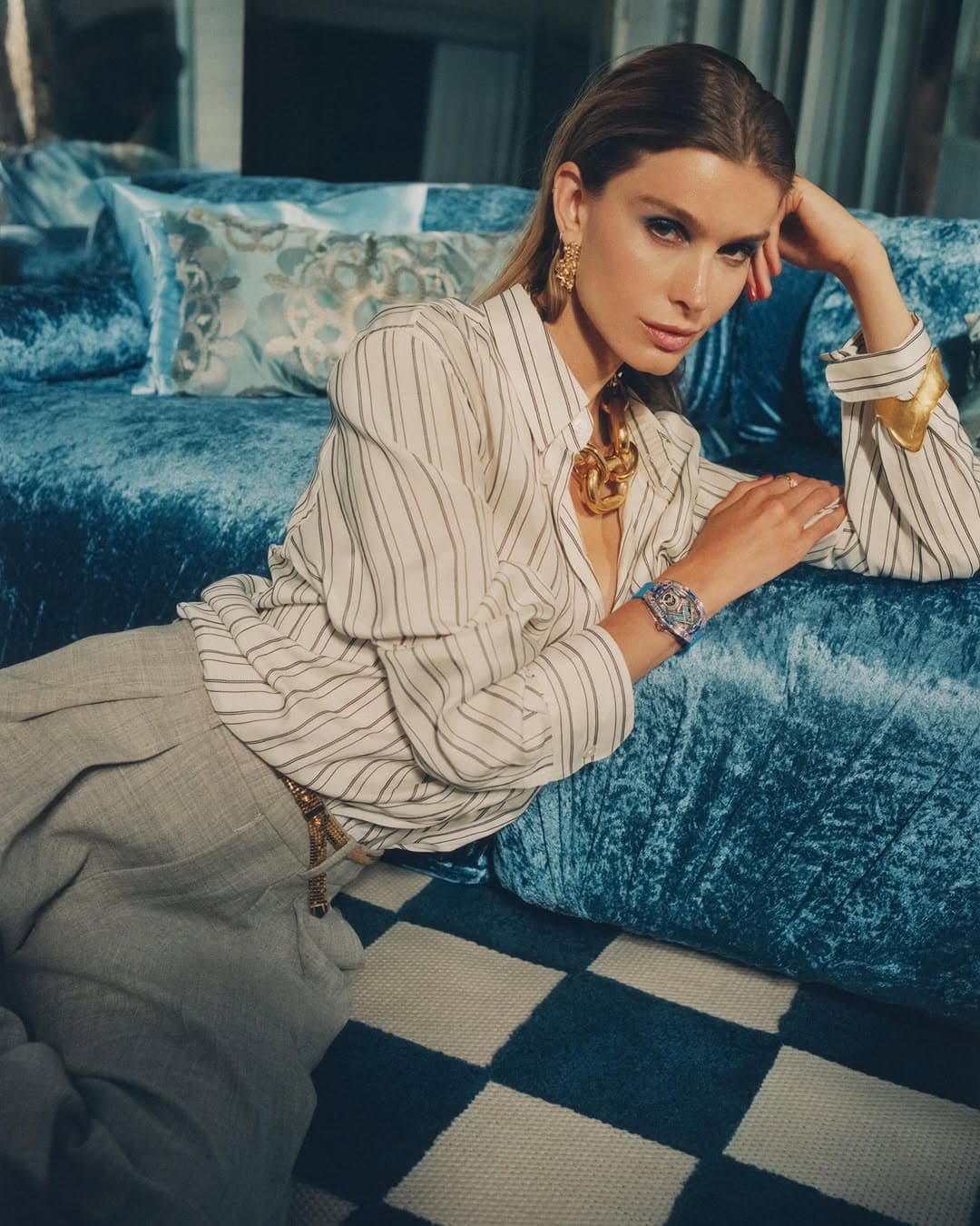
Blue is the first colour we explore in The Dazzling Division film, and it arrives with the crisp assurance of a well set collar. Not timid, not merely pretty, it is blue as atmosphere, blue as attitude, blue as the light you get just before evening decides what it wants to be. In an impromptu photo shoot staged by our muses in their mirrored living room, the shade does what the best styling always does, it edits the world, cooling the room, sharpening silhouettes, and making every reflective surface feel like a portal.
This chapter is where the film teaches you how it wants to be watched. Blue turns the domestic into something deliberately cinematic. The mirror does not simply repeat, it multiplies. The living room does not simply hold a scene, it becomes one. The effect is retro futuristic without the usual sci fi theatrics, more 1970s lacquer and studio flash than spaceship. If you have ever loved the particular chill of tungsten light against polished metal, you understand the mood instantly.
Blue in The Dazzling Division film, a cool beginning with surreal edges
Starting with blue is a decision, not a default. It sets us off on a journey from cold to warm, a narrative you can feel on the skin before you can name it. Blue keeps everyone disciplined. It asks for clean lines, controlled gestures, and a touch of restraint that reads as confidence. Yet it also slips in a pinch of surrealism, the kind that makes a familiar room feel gently untrustworthy.
Paul Éluard’s famous line, the world is blue like an orange, is not quoted here as a clever flourish. It functions like a key. Blue becomes elastic, capable of holding contradiction. In the mirrored room, that paradox is visible. A face is both near and far. An object is both real and doubled. It is a reminder that colour, when used with intention, can bend logic without announcing itself.
The mirrored living room as a set, not a backdrop
Mirrors are often treated as a shortcut to glamour, but here they do something thornier. They create a stage where the muses can compose themselves in real time, catching the angle, correcting the posture, re entering the frame with a different energy. The result feels intimate rather than performative, as if you have walked in on a private rehearsal that happens to be exquisitely lit.
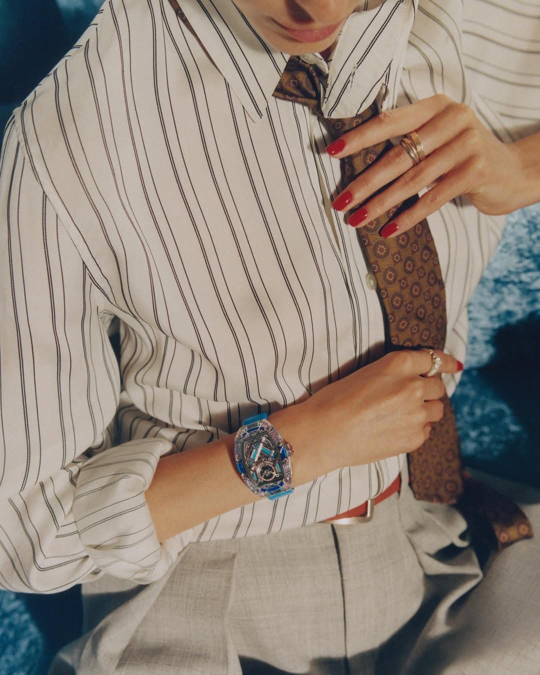
The cool palette amplifies every surface detail. Glass turns icier. Metal reads brighter. Fabric takes on a sleeker, more graphic character. A watch glints and suddenly time feels like part of the styling, not merely an accessory. It is no surprise that this world speaks fluently to a house like Richard Mille, where engineering and spectacle are never separated, and colour often behaves like a material in its own right.
Retro futurism, made human
Retro futurism can veer into costume when it leans too hard on references. The Dazzling Division film avoids that trap by keeping its futurism tactile. It is in the sheen of a reflective wall, the cool burn of flash, the deliberate geometry of the compositions. You feel it more than you are asked to decode it.
There is also a distinctly photographic logic at play, the kind you recognise from editorial work that understands restraint. Blue is not used to shout. It is used to tune. It pulls the whole scene into a narrower frequency, where micro expressions matter and a slight shift of shoulder can change the temperature of the frame.
Why blue photographs like a conviction
Blue has always been one of fashion’s most reliable liars, it can look expensive without being fussy, and severe without becoming cold hearted. In this chapter, blue behaves like a filter for the psyche. The muses appear more composed, more sculptural, and yet oddly more vulnerable, because the mirror keeps catching what the camera does not control.
If you want the cultural lineage, you can trace blue’s emotional range from Yves Klein’s saturated devotion to Derek Jarman’s radical, aching monochrome. A quick reread of Éluard via a reputable source like Poetry Foundation helps, too, not to intellectualise the mood, but to remember that blue has long been the colour of beautiful impossibilities.
How to read the styling, and why it matters
The most persuasive styling is not about quantity, it is about clarity. Here, blue is the organising principle. It makes the mirrored living room feel like an installation, and it makes the impromptu photo shoot feel inevitable, as if the muses simply noticed the room’s potential and decided to answer it.
For readers who come to this film through an interest in fashion and objects, it is worth lingering on the way blue bridges categories. It belongs to clothing, certainly, but it also belongs to interiors, to metalwork, to the cold shine of accessories. That interplay is exactly why colour stories remain one of the most enduring editorial tools. They do not just show you what to wear, they show you how to look.
And if you are curious about the eye behind the lens, take a look at Linus Morales, whose images catch that specific tension between polish and spontaneity, the feeling that the set is perfectly composed, yet still alive to accident.
Photo Credits
Cover image courtesy of Richard Mille, photographed by Linus Morales. Additional images courtesy of their respective owners.