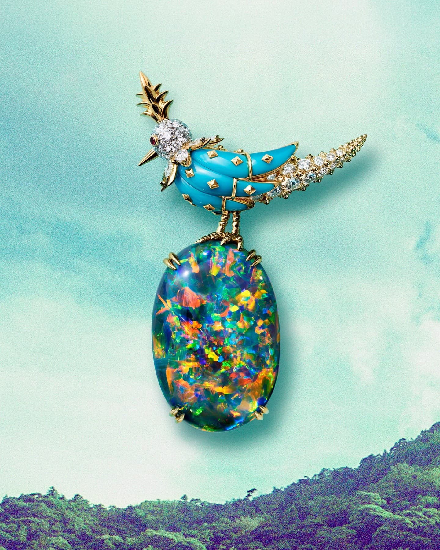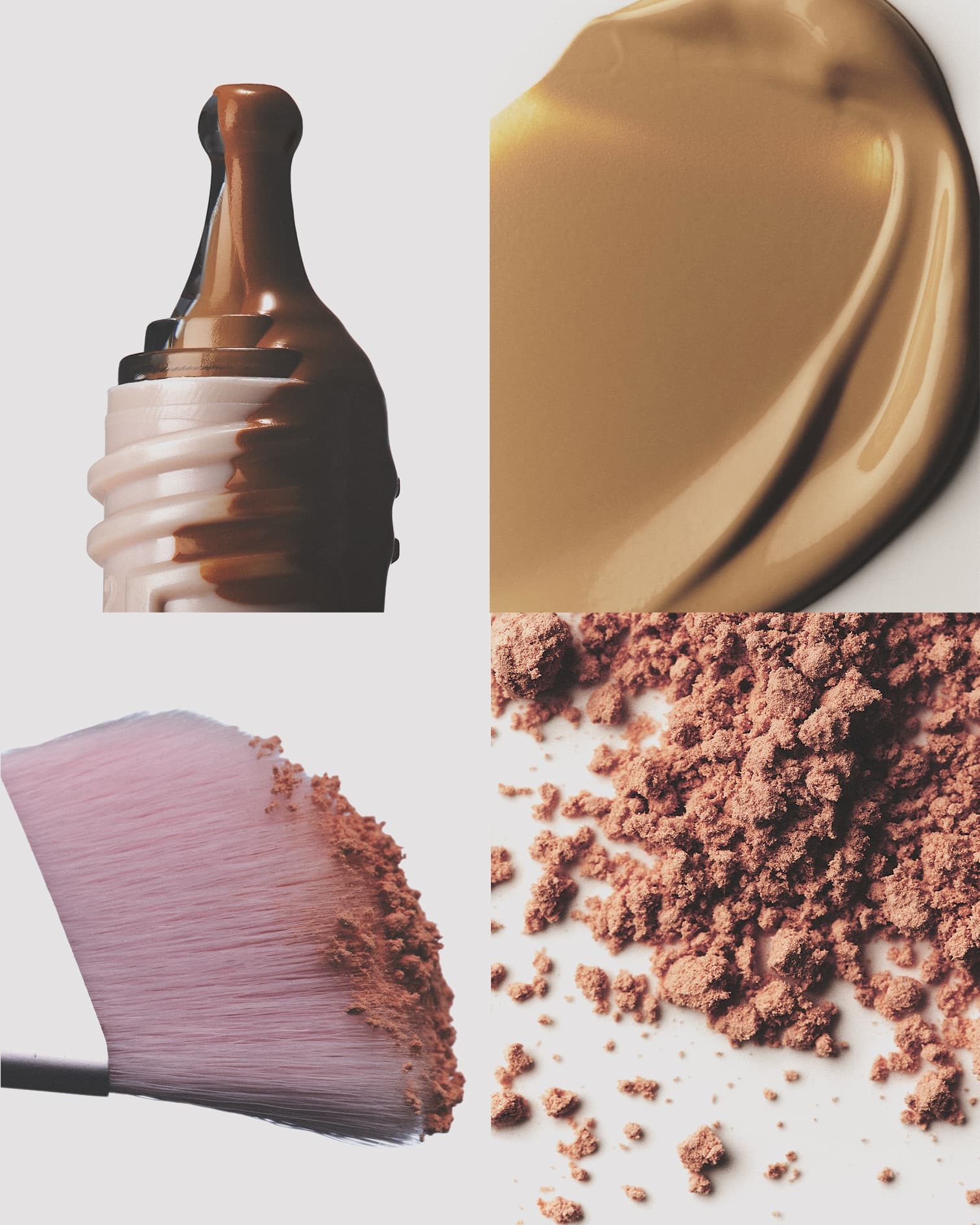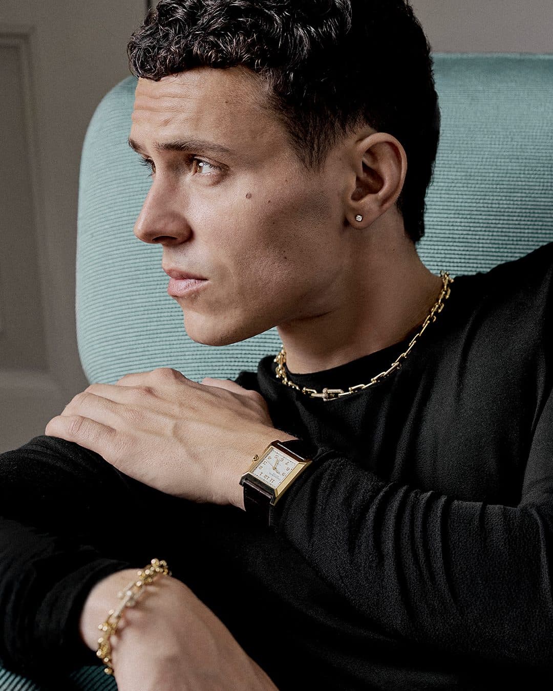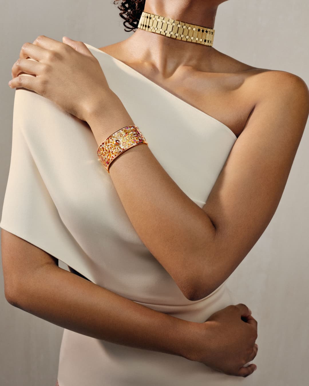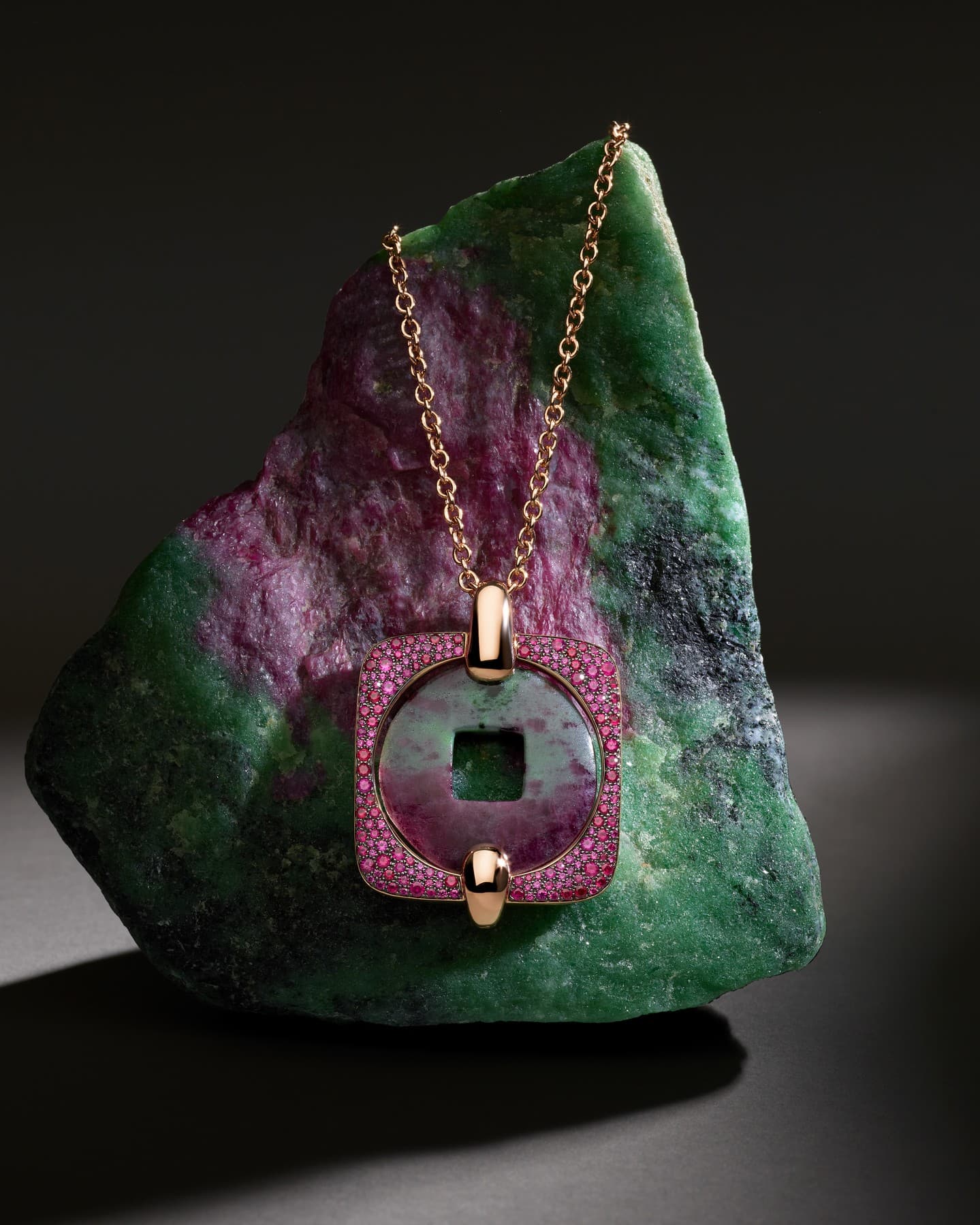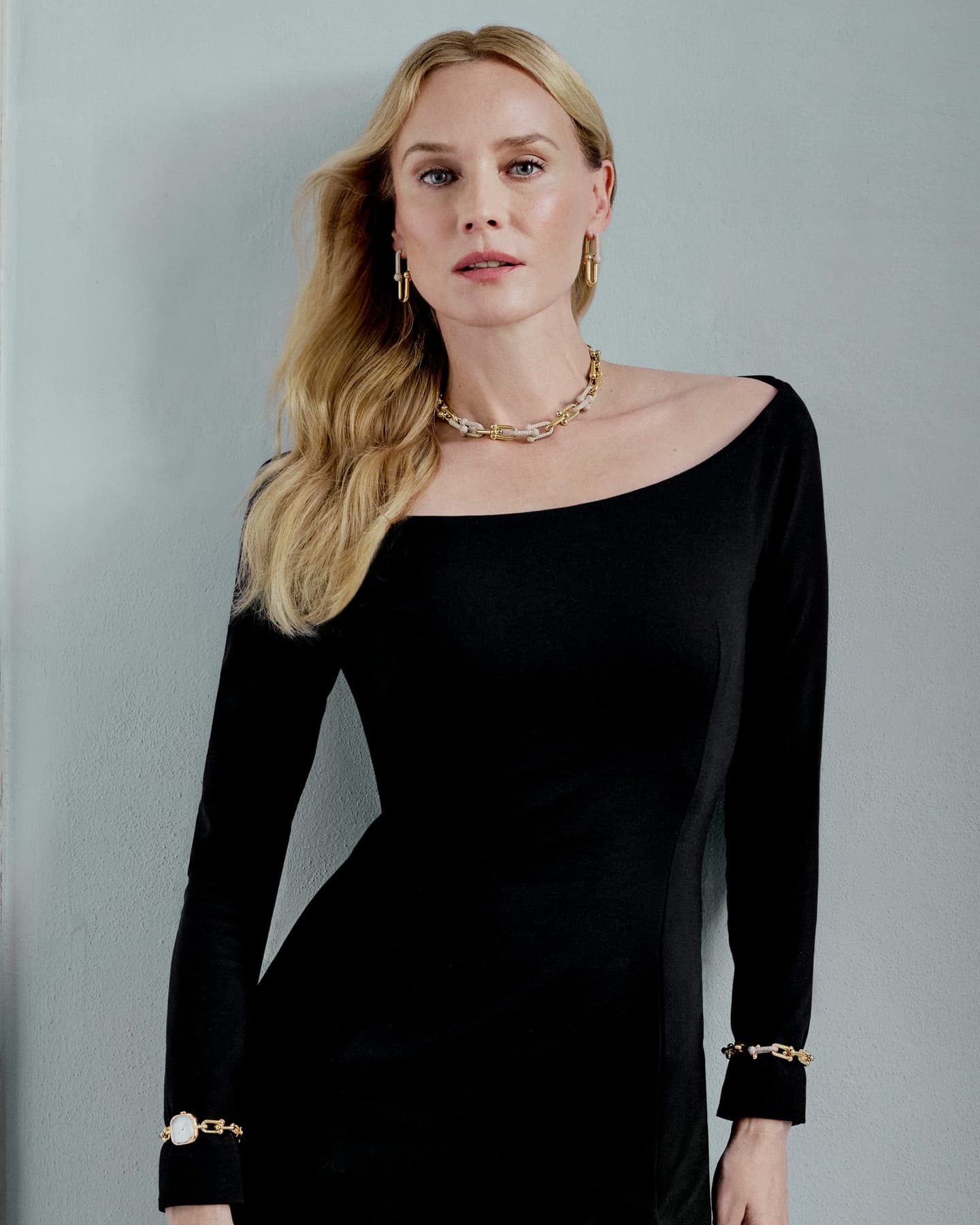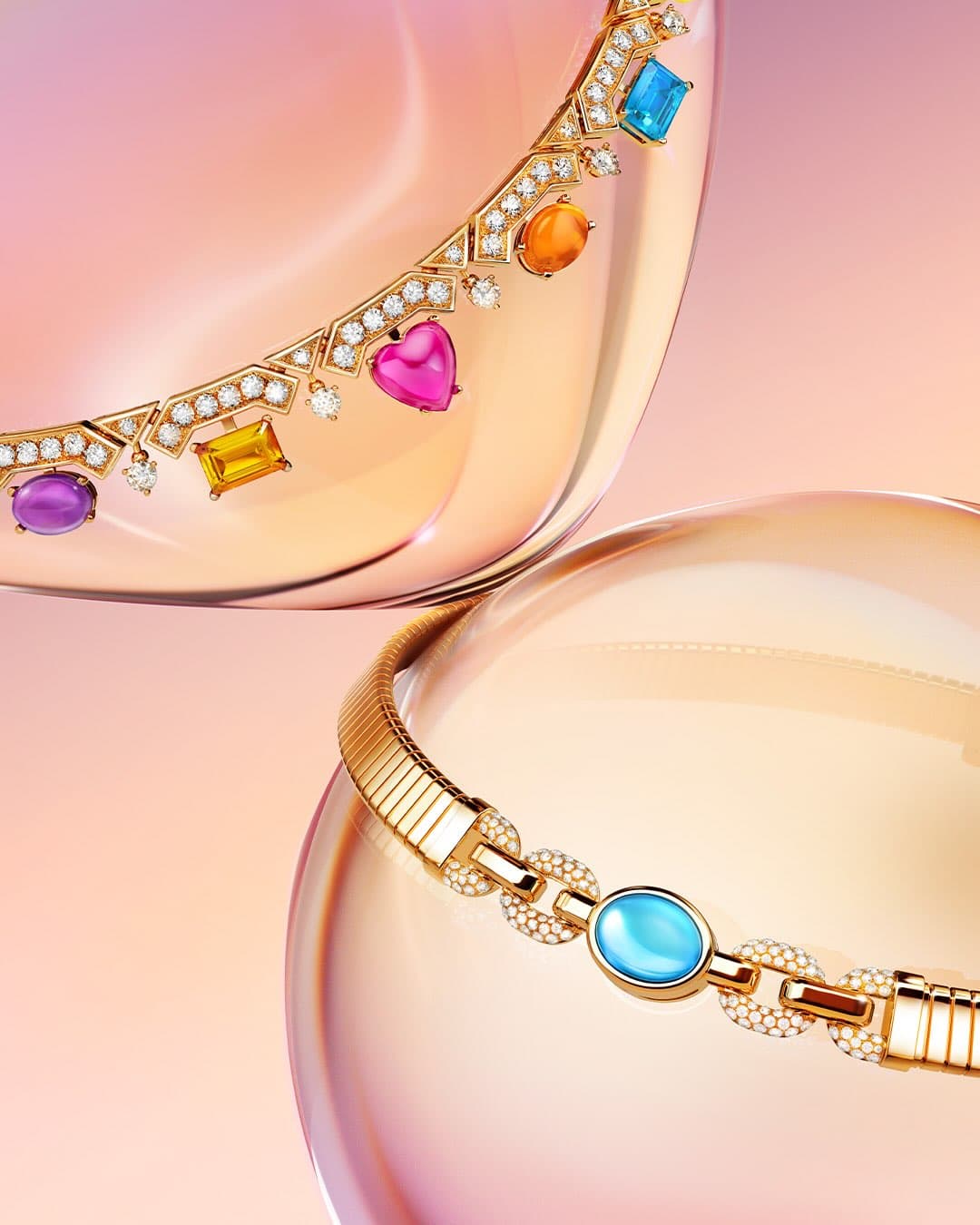
There are brands that use colour as decoration, and there are brands that build with it. Bvlgari Colors, a campaign framed by the Maison as an “emotional language,” belongs to the second category, colour treated less like styling and more like structure, the same way a jeweller thinks in stones, cuts, and contrast.
Bvlgari Colors: colour as a house code, not an accent
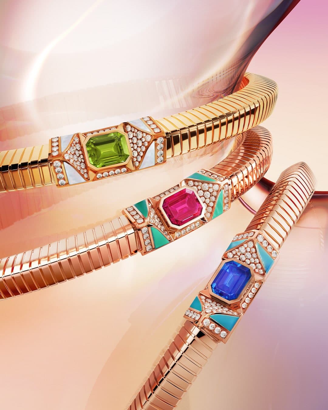
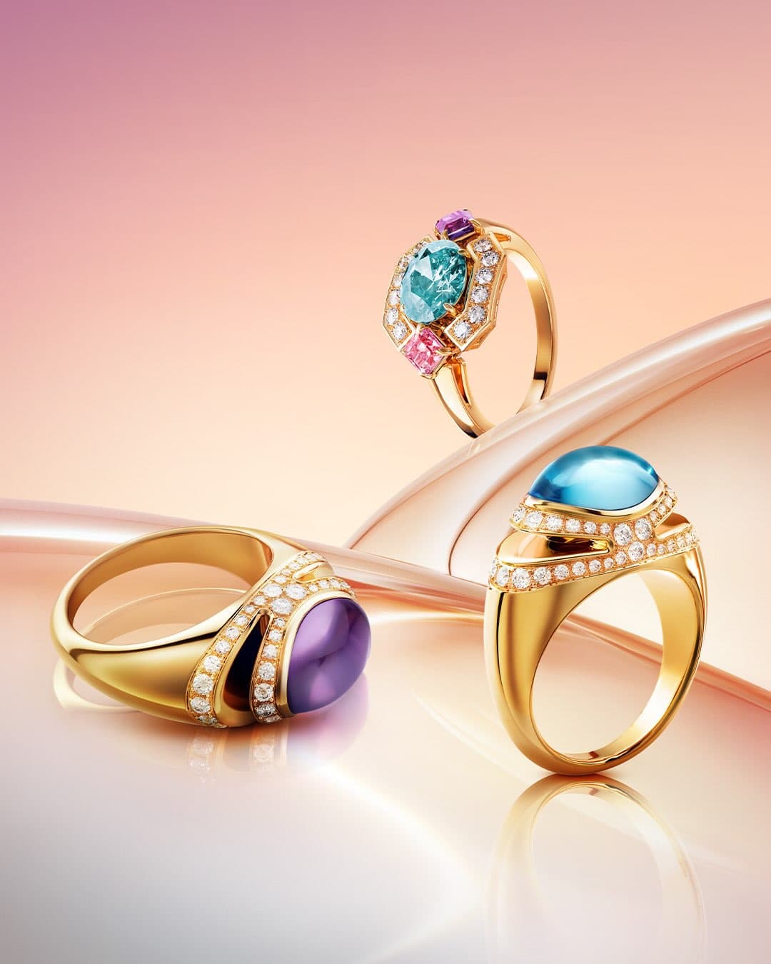
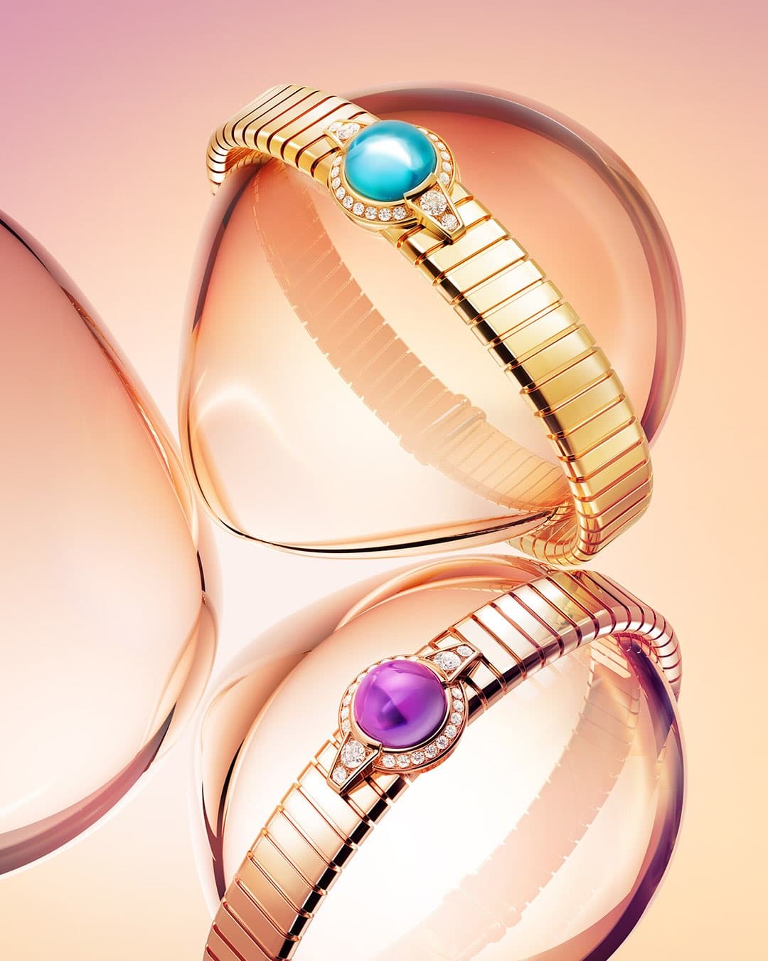
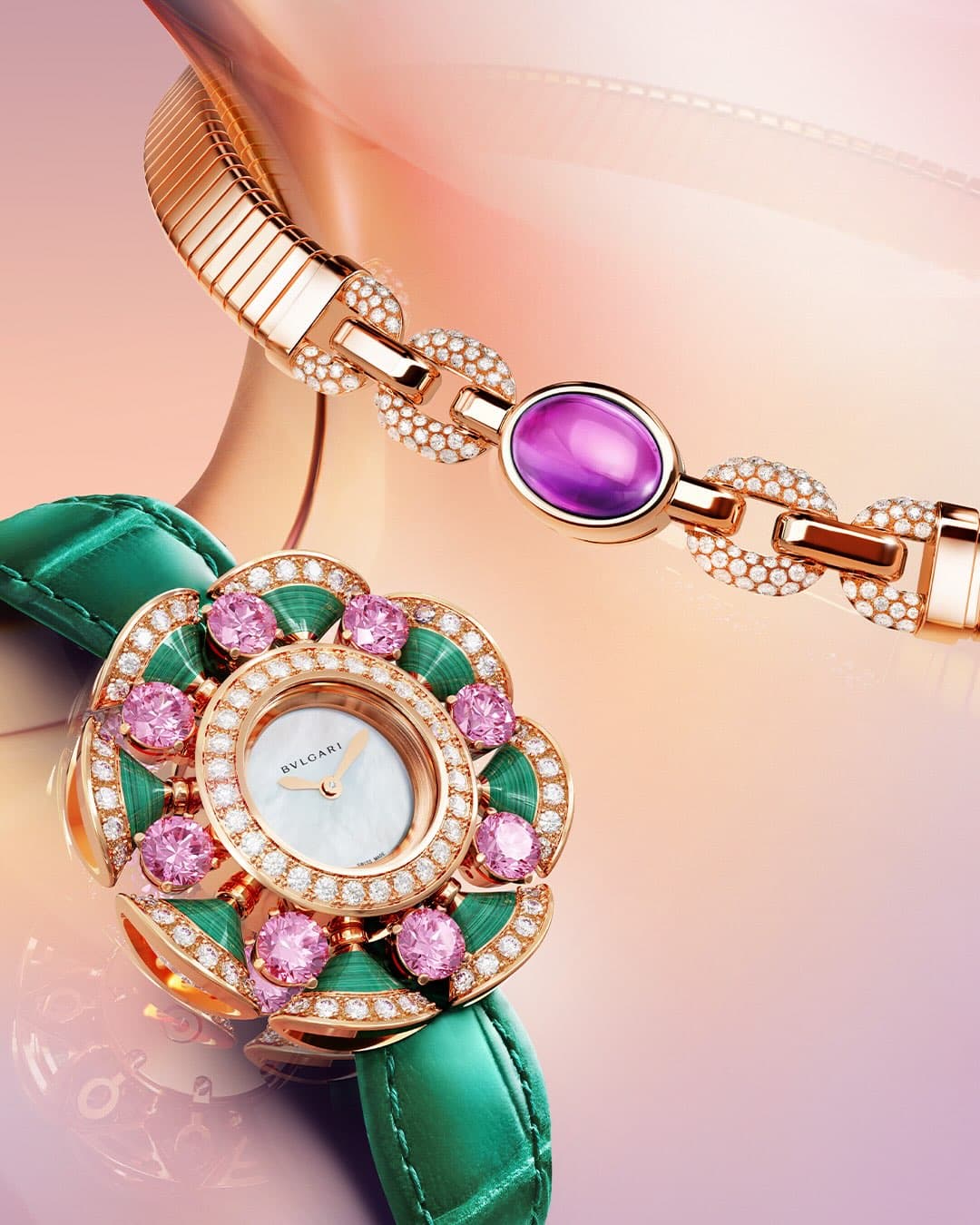
The clue is in the name. Bvlgari Colors is positioned, in the brand’s own words, as a celebration of colour “as a defining expression of Bvlgari’s identity,” channelled through the house’s craftsmanship and creative vision. That language matters because it points to a long Roman habit at Bvlgari, where saturated palettes are not seasonal garnish but part of the signature that readers recognise even at a glance.
Colour at Bvlgari is rarely flat. It tends to arrive as pairings and stacks, jewellery logic applied to visual storytelling: a dominant hue, a secondary note, then a flash that changes the temperature of the whole image. In the Bvlgari Colors world, you can feel that approach, the idea that colour is chosen with the same decisiveness as a stone, and placed with the same care as a setting.
What “emotional language” looks like when the brand is Bvlgari
Luxury houses talk about emotion all the time. What makes Bvlgari’s claim more convincing is that its public identity has long been anchored to colour in a way that is easily verifiable in the brand’s most recognisable lines. If you know the Serpenti motif or the house’s high jewellery history, you know Bvlgari is at its most itself when chroma is doing the talking, not a press release.
That is why Bvlgari Colors feels less like a one off mood board and more like a tightening of focus. It tells you, directly, that Bvlgari wants to be judged on how it handles hue, not just how much brilliance it can put under lights. And it raises a useful question for anyone who buys, collects, or simply looks: when colour is the point, what does craftsmanship mean?
Craft becomes visible at the edges
When colour leads, the eye starts hunting for transitions: how one surface meets another, where the shine turns to shadow, where a material changes in texture. In campaign imagery, these are the places you linger, because they are the places that suggest time and handwork rather than a filter. Even if you never see a bench jeweller at work, you can still read decisions, the way a hue is framed, balanced, or pushed forward.
Why this matters now, beyond one campaign
Fashion and jewellery have spent the last few years toggling between extremes, maximal statements on one side, and a pared back uniform on the other. Bvlgari Colors lands as a reminder that colour can be a point of view rather than a volume knob. It argues, implicitly, that a house with a strong visual alphabet does not have to chase novelty. It can deepen what it already does well, and let the public catch up.
If you want the brand’s own framing, the campaign tag and positioning appear through BVLGARI’s official channels, including Bvlgari’s official site and the house’s social storytelling under BVLGARI Official on Instagram, where “Bvlgari Colors” is presented as a celebration of colour and identity.
For readers tracking how jewellery houses build modern desire, this is the takeaway: Bvlgari Colors is a declaration that the Maison intends to keep speaking in vivid tones, and expects its audience to listen with their eyes.
If colour led design is your current fixation, you may also want to browse our watch stories and fashion coverage for the way other houses are handling pigment, material, and light right now.
Photo Credits
Images courtesy of their respective owners.