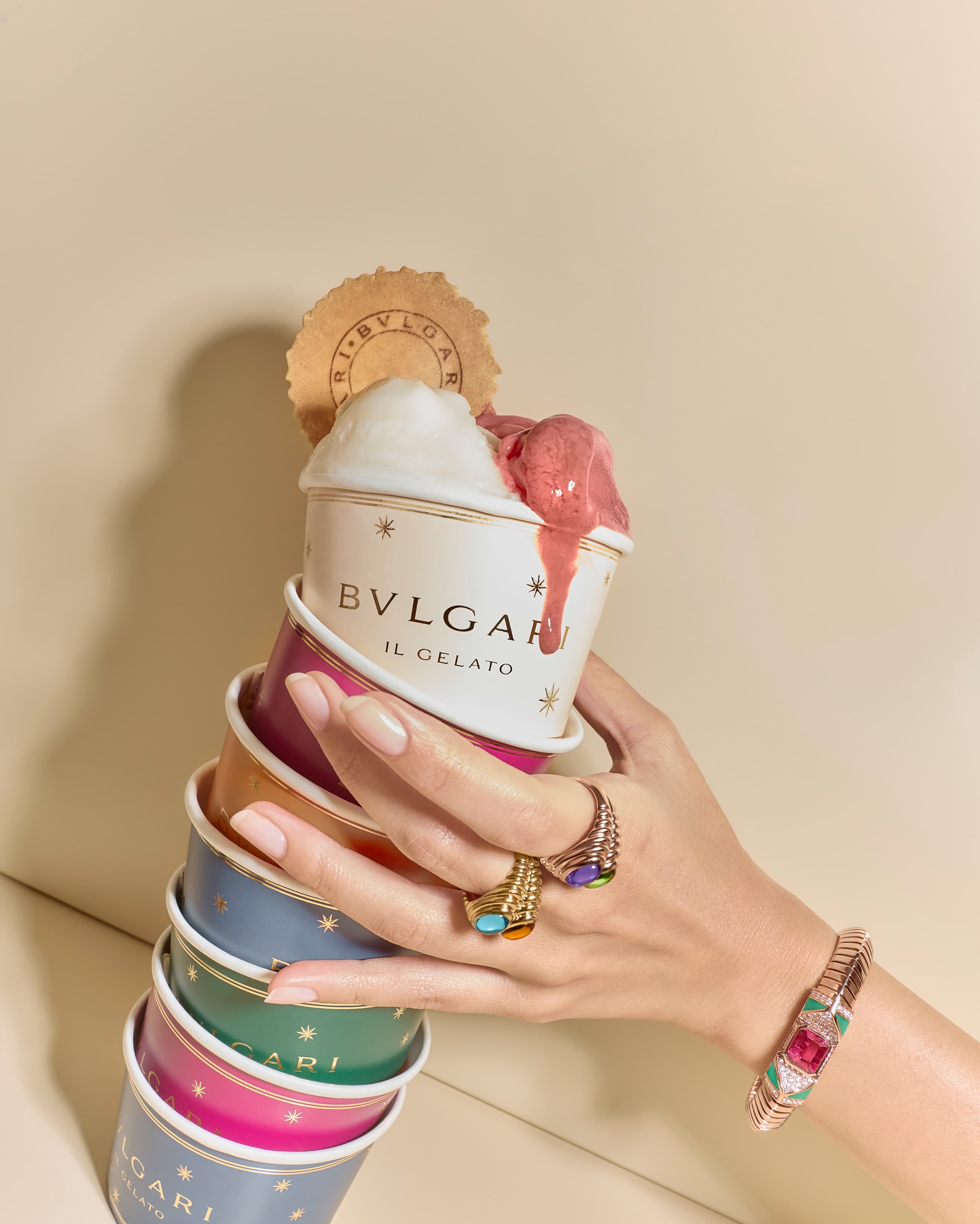
On paper, gelato and high jewellery should barely speak. One melts in minutes, the other is built to outlast decades. Yet this season, Bvlgari gelato is being framed with the same logic the house brought to its most audacious era: the late 1970s and 1980s, when colour was worn like a declaration and “too much” was simply a point of view.
The brand’s own tease, “Who said gelato couldn’t be precious?”, is a very Bvlgari provocation. It also lands with particular force coming from Rome’s most unapologetic jeweller, a maison that has long treated unexpected pairings as a house language rather than a marketing trick.
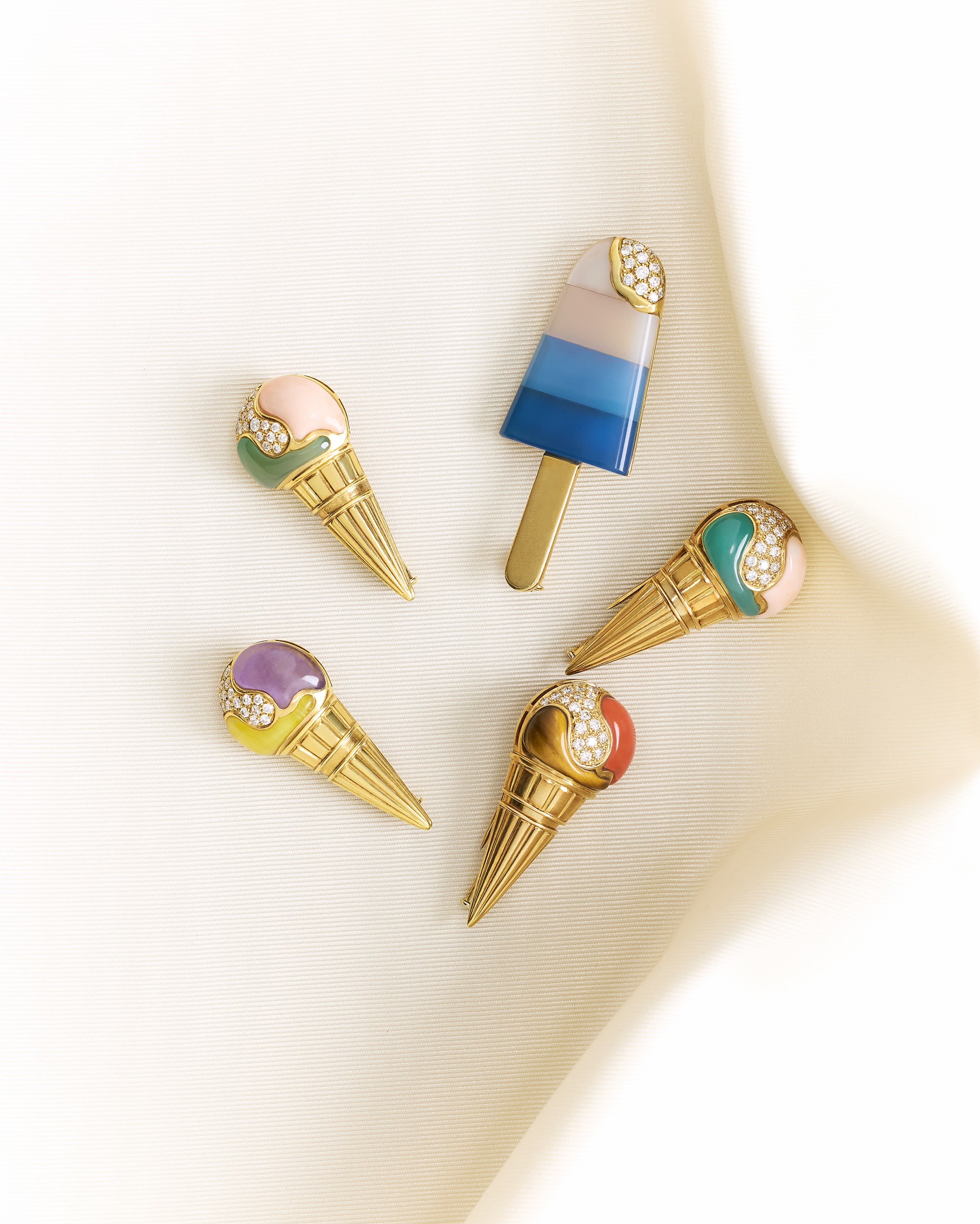
Why Bvlgari gelato makes sense, especially now
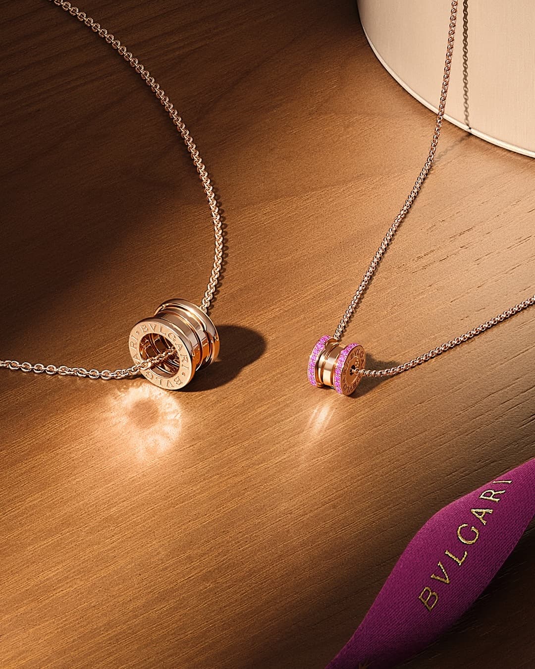
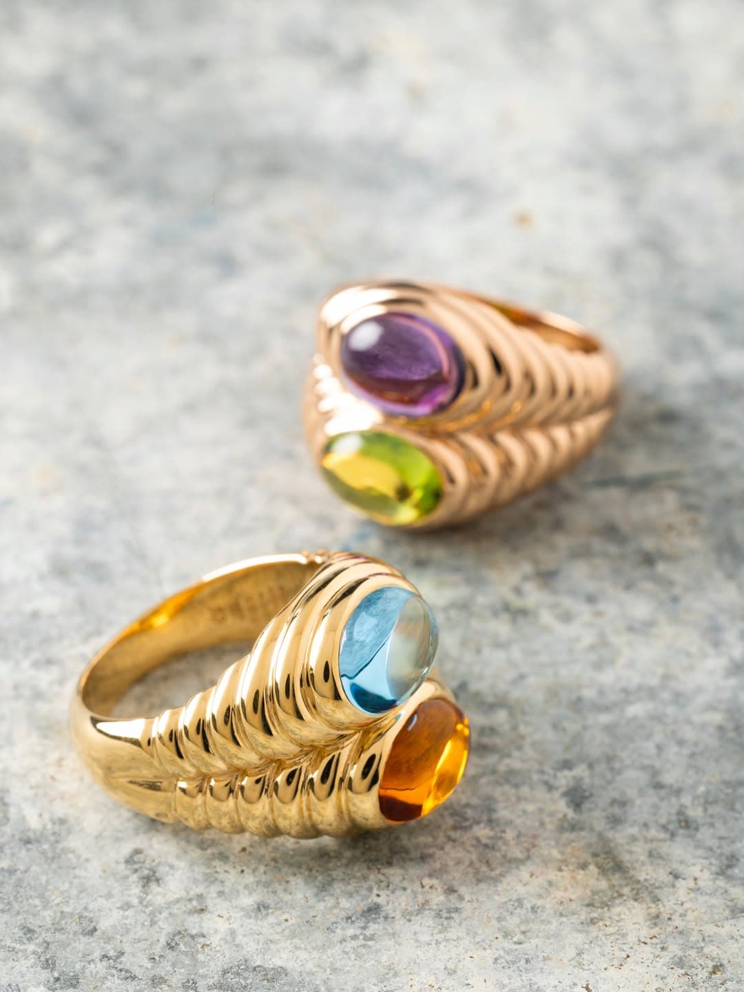
To understand why Bvlgari gelato doesn’t feel like a gimmick, you have to revisit what the house was doing a half century ago. In the 1970s and 1980s, Bvlgari leaned hard into sculptural gold, saturated gemstones, and a kind of cultured flamboyance that never needed irony. Those decades are still referenced in modern Bvlgari design cues, from cabochon stones to architectural volumes and emphatic colour contrasts.
That design attitude translates cleanly into food culture, where “luxury” is increasingly about craft, provenance, and a sense of occasion. A seasonal gelato moment, reframed with Bvlgari’s maximalist DNA, becomes less about eating dessert and more about staging a ritual. It’s the same instinct that keeps Serpenti returning year after year, renewed through materials and context rather than diluted by repetition.
If you want the official lens, Bvlgari positions its current aesthetic under the banner of “Roman exuberance” and a very specific relationship to colour and volume. The brand’s own history and current collections make that continuity clear on Bvlgari’s official site.
Precious, but not precious about it
The cleverness here is that the “precious” claim doesn’t need literal gemstones to land. Precious can be a finish, a form, a packaging gesture that borrows from jewellery codes: the snap of a clasp, the geometry of a case, the way a surface catches light. When applied to an Italian summer icon, it gives gelato the kind of visual authority normally reserved for objects kept behind glass.
And importantly, Bvlgari’s 1970s and 1980s references matter because those years weren’t about minimalism. They were about confidence, about letting colour do the talking. In dessert terms, that means flavour and hue that are meant to be seen as much as tasted. The point is not to make gelato “serious”, it is to let it be glamorous.
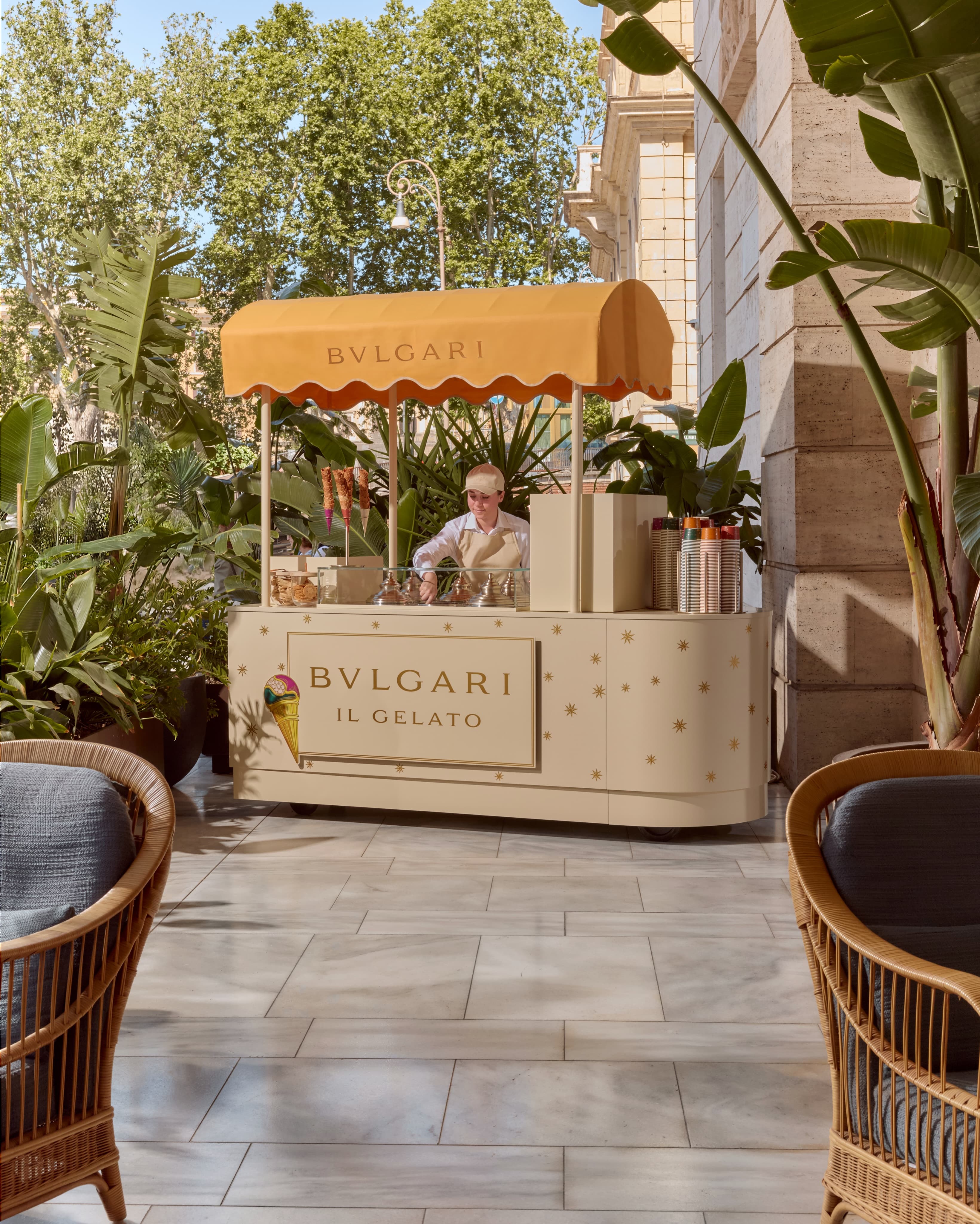
The larger play: luxury’s new summer language
Luxury houses have been circling around food for years, but the projects that endure tend to do one thing well: they reflect the brand’s visual grammar rather than stapling a logo onto a scoop. This is why the Bvlgari gelato idea feels plausible inside the maison’s wider world, which already spans hospitality alongside jewellery, watches, and accessories.
Bvlgari Hotels and Resorts, for instance, has built an identity around Italian polish with Roman specifics, an ecosystem where a dessert moment can sit naturally beside an aperitivo or a terrazza dinner. The hospitality arm’s ongoing expansion is documented by the brand at Bvlgari Hotels and Resorts, and it helps explain why a gelato shaped by house codes doesn’t feel like a one off stunt.
In other words, this isn’t jewellery trying to cosplay as cuisine. It is a house skilled at turning everyday pleasure into an object lesson in design. If the 2010s taught luxury to whisper, the 2020s are giving it permission to flirt with spectacle again, in small, convivial doses.
Where this leaves the rest of us
You don’t need a Serpenti on your wrist to understand the appeal. You simply need the appetite for a summer moment that feels considered, a little theatrical, and unmistakably Italian in its confidence.
Photo Credits
Images courtesy of their respective owners.