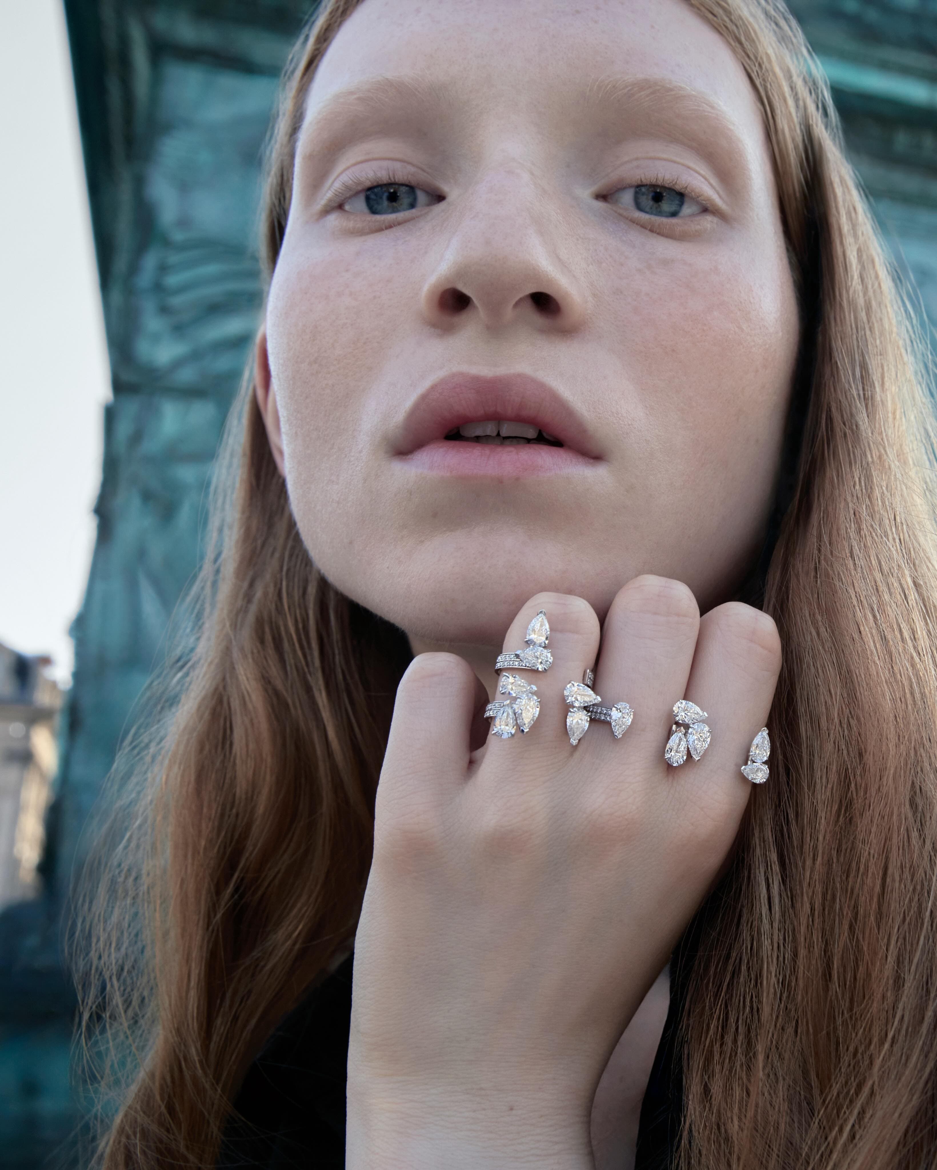
The blue on Place Vendôme is never one blue. It changes with the hour, the traffic, the pale Parisian glare that turns stone almost silver, then suddenly makes it glow. Repossi has built an anniversary around that exact instability, and it feels right for a house whose most compelling work has always been about tension, edges, and light caught mid move.
In 2026, Repossi marks forty years at 6 Place Vendôme, and ten years since the flagship’s redesign by Rem Koolhaas and OMA. To celebrate, the Maison is releasing exclusive Vendôme editions of its three jewellery pillars, Antifer, Berbère and Serti sur Vide, each riffing on the shifting blues seen on the Vendôme Column.
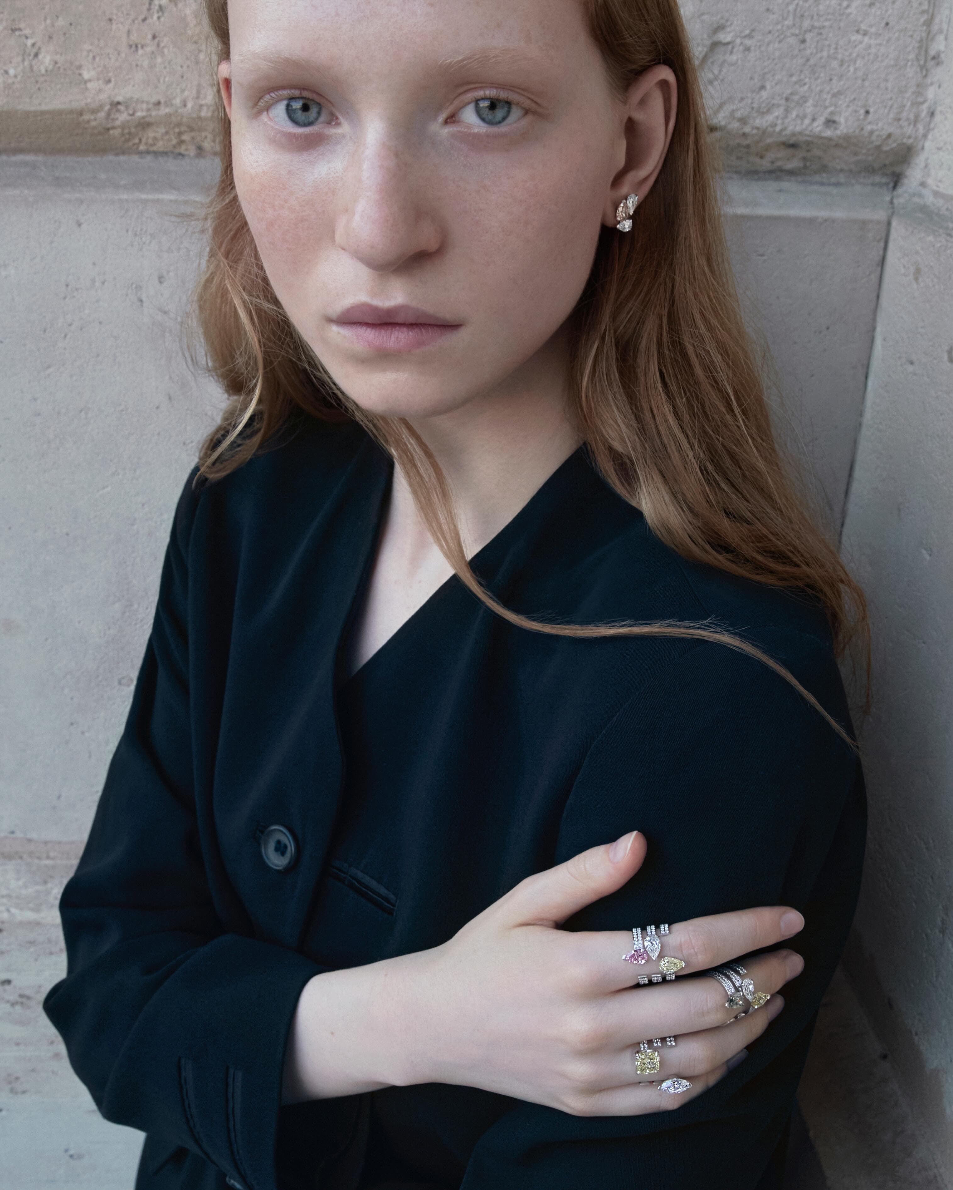
Repossi Place Vendôme editions, and why the column matters
The Place Vendôme address is not a stage set. It is a working ecosystem where heritage, money, craft, and real design ambition collide daily. Repossi’s point of view has long been more architectural than nostalgic, more line and volume than florals and flourishes. So anchoring the 2026 Repossi Place Vendôme editions to a single, highly legible Parisian object, the column at the centre of the square, is a smart kind of symbolism. The column is pure message: a monumental spiral casting different colours depending on weather and angle, a reminder that permanence is often just perception.
What makes this anniversary gesture compelling is that it places the shifting blue as a design brief rather than a marketing mood board. Colour in high jewellery can easily become a shortcut to sentiment. Here, it is treated more like a surface condition: a phenomenon you read across angles, facets, and negative space.
OMA’s 2016 redesign: when a flagship behaves like a gallery
Repossi’s 2016 flagship redesign by Rem Koolhaas and OMA is often referenced in the same breath as contemporary art spaces because it borrows that discipline: spare, deliberate, engineered to slow you down. That approach suits Repossi, whose modernist language can be swallowed by more traditional luxury staging.
Koolhaas’s name also matters in a deeper way. OMA’s best projects understand how people move through power, how institutions choreograph attention. Place Vendôme is itself an institution. The redesign made the boutique feel less like a velvet lined box and more like an environment where jewellery is asked to hold its own, as object, as idea, as silhouette.
For context on the practice behind the space, OMA’s own profile of the studio explains its interdisciplinary scope and current leadership. https://oma.eu
Antifer, Berbère, Serti sur Vide: three pillars, three ways of catching light
Antifer
Antifer is Repossi at its most graphically sharp. Named for the cliffs at Antifer in Normandy, the line’s geometry has always suggested something cut by nature and re cut by human intent. In a Place Vendôme edition, that crispness becomes an advantage. A blue that shifts needs edges to articulate it.
Berbère
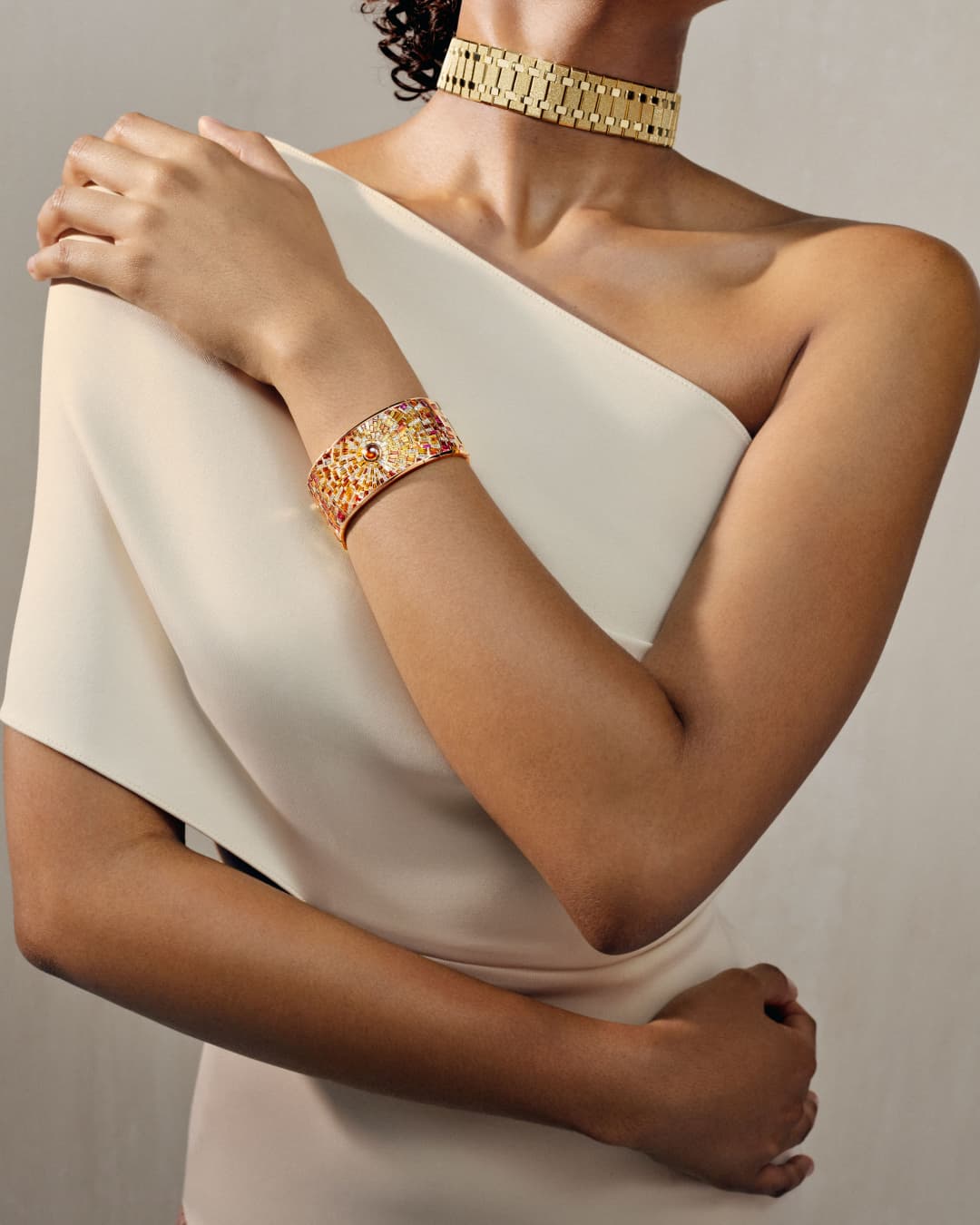
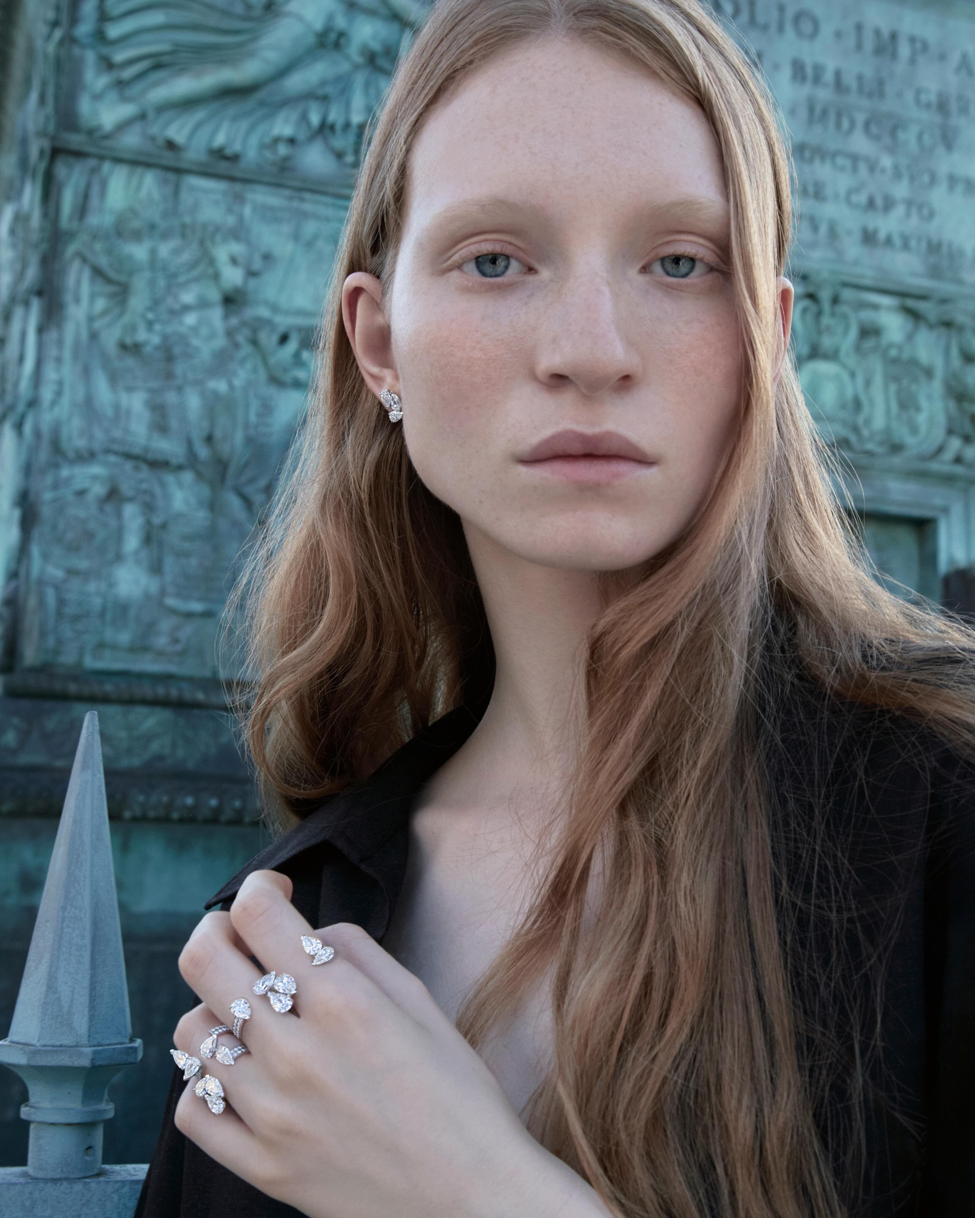
Berbère sits closer to the body, often reading as a kind of modern talisman. Its language is more circular, more intimate. A blue inspired by the Vendôme Column, wrapped around the finger or wrist, feels like an elegant inversion: public monument translated into private orbit.
Serti sur Vide
Serti sur Vide is the purest expression of Repossi’s fascination with absence. The stones appear suspended, the setting engineered to make the air part of the design. If a Place Vendôme blue is truly the subject, this is the collection that can make it feel like atmosphere rather than pigment.
Repossi has not, at the time of writing, publicly standardised pricing or a single global on sale date for these specific Place Vendôme anniversary editions. Expect boutique led availability, the kind that prioritises in person discovery and client appointments. For updates direct from the Maison, start with the official site. https://www.repossi.com
A Paris anniversary that resists nostalgia
Anniversary jewellery can veer into self congratulation. Repossi’s better instinct is to make the address do the talking: 6 Place Vendôme as a vantage point, not a trophy. Forty years on the square and a decade into an OMA redesign is not a prompt to look backward, but to clarify what the house wants to be in the next cycle of Paris luxury, where design literacy matters as much as diamond weight.
For a broader look at how today’s maisons are treating architecture as part of brand language, we have been tracking it through Culture as much as through jewellery itself.
Photo Credits
Images courtesy of their respective owners.