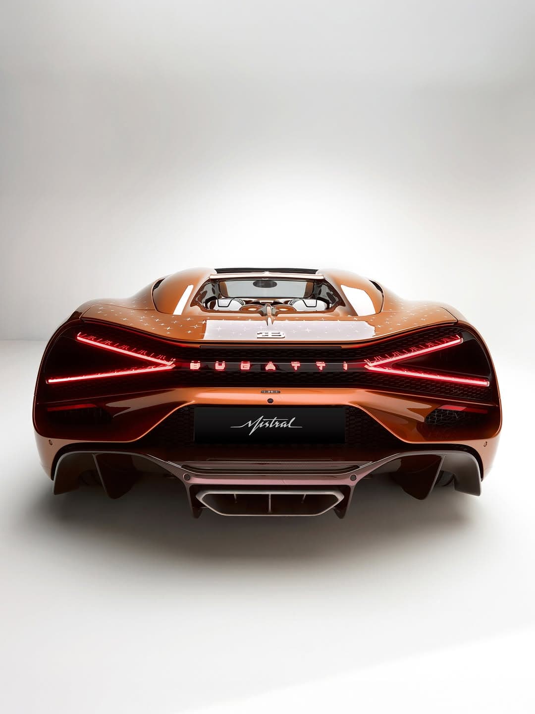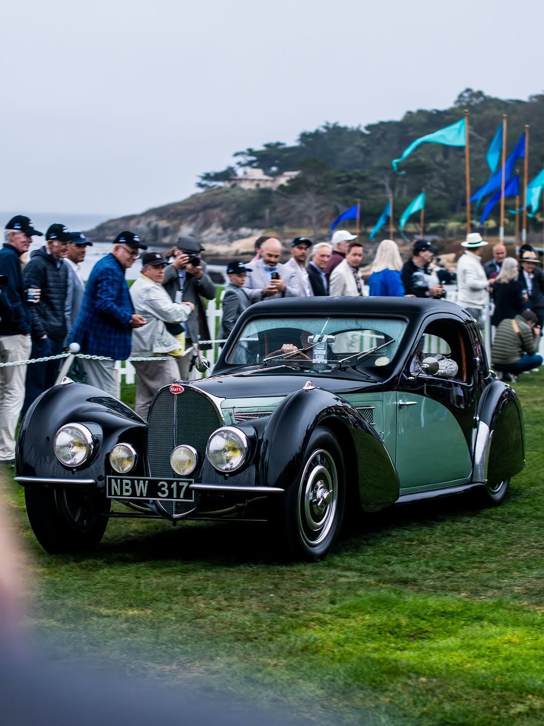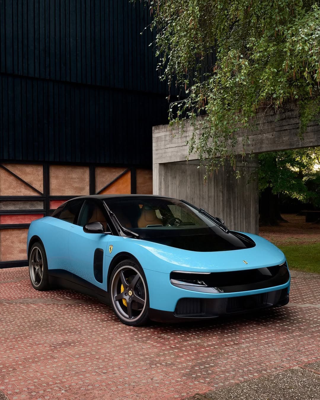
The Ferrari Luce in Azzurro La Plata is not a colourway you simply notice, it is one you register in your body. It has the particular clarity of early evening light on stone, cool at first glance, then unexpectedly warm as it moves across a curve. In a world of loud finishes that beg for attention, this shade does something rarer, it creates its own silence. The car becomes a kind of moving architecture, clean lines catching the scenery, returning it with a gentler, more flattering edit.
That, to me, is the secret of Azzurro La Plata. It reads as timeless without leaning into nostalgia, polished without feeling precious. It is the sort of blue that makes even familiar streets look newly composed, as if someone has tightened the frame and adjusted the exposure by half a stop.
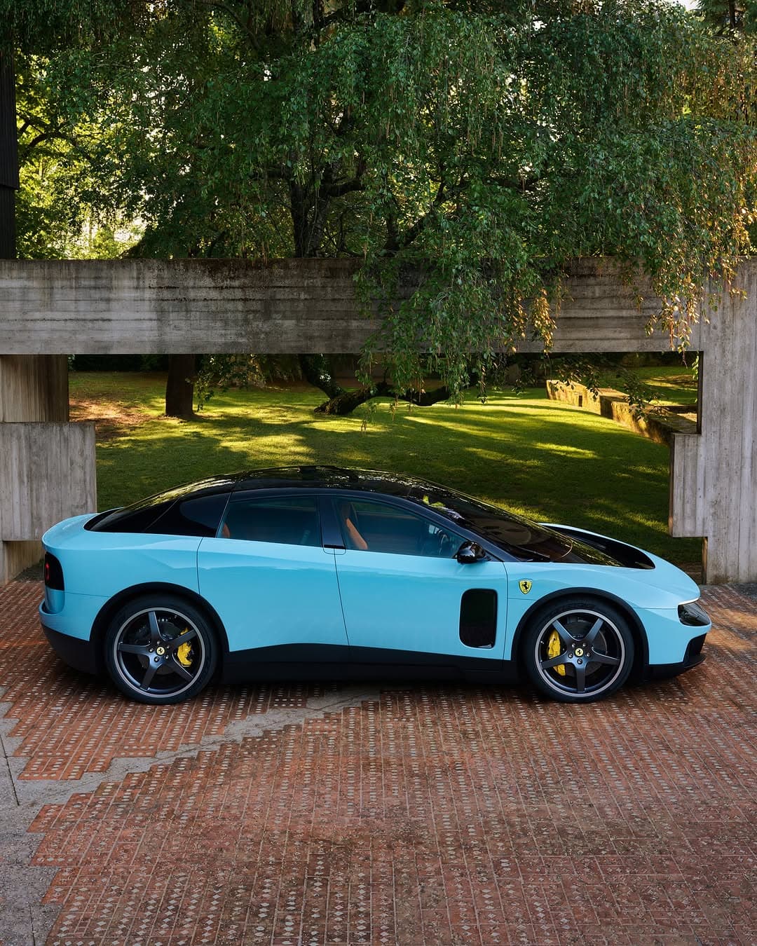
Ferrari Luce in Azzurro La Plata, a modern classic in motion
When people talk about “presence” in automotive design, they often mean scale, noise, or a kind of performative aggression. The Ferrari Luce in Azzurro La Plata offers a different proposition, presence through restraint. The finish is luminous rather than glossy, metallic without tipping into the obvious. It is flattering to daylight and unusually kind to shadow, which is where the best silhouettes live.
Here is what makes it feel so elegant. Azzurro La Plata holds a whisper of silver within the blue, so the bodywork seems to change temperature as you circle it. In brighter conditions it reads crisp and airy. In softer light it leans deeper, almost slate like, giving the car a quietly tailored seriousness. It is the automotive equivalent of a perfectly cut coat in a complex neutral, the kind you keep reaching for because it never looks wrong.
If you want the official language, Ferrari’s own design world is worth spending time with at Ferrari, where the brand’s obsession with form and finish is more philosophy than marketing. For broader cultural context, I often find myself cross referencing the way colour behaves in photography and industrial design through institutions like The Design Museum, because the best finishes belong to a larger visual conversation.
Why this shade suits scenery so well
Some cars dominate a landscape. Others cooperate with it. The Ferrari Luce in Azzurro La Plata has an unusually photogenic diplomacy, it picks up what is around it and returns it with a cool refinement. Against greenery, the blue looks cleaner, almost aquatic. Near pale stone or concrete, the silver undertone becomes more pronounced, giving the body a faint moonlit quality. And in cities, where reflections can become messy, this paint seems to simplify the visual noise, turning windows and streetlights into sleek, controlled highlights.
There is also a distinctly Italian sense of taste at play, not the caricature of maximal glamour, but the kind you see in beautifully worn piazzas and impeccably made objects. Azzurro La Plata feels in conversation with that tradition, the idea that luxury can be quiet, and that confidence has no need to shout.
Light, line, and the pleasure of understatement
Understatement is not the absence of drama, it is the presence of judgement. With a colour like this, the drama sits in the surface tension, the way the light pulls along a fender, the way a shoulder line stays crisp even when the day softens. It is the difference between a look that photographs well and a look that lingers in memory.
For readers who collect luxury across categories, it is the same instinct that drives a love of considered objects, the kind we cover in Luxury, where the best pieces are as much about proportion as they are about price. It is also why automotive design belongs alongside watches and fashion, not beneath them. A car like this is worn, in a sense, it is part of how you move through the world and how the world reads you.
How to style the moment around a Ferrari Luce
Yes, style, because the most compelling cars always create a small ecosystem. Azzurro La Plata invites a certain palette. Think off white, charcoal, deep navy, tobacco leather, and the occasional sharp black detail. It also pairs beautifully with tactile materials, matte knitwear, brushed metal, suede. High gloss around this shade can feel competitive, while texture makes it feel intentional.
If you are the kind of person who reads cars the way you read wardrobes, it is worth exploring how design language carries across disciplines. Our Fashion pages often return to the same idea, that elegance is the art of choosing what not to add. And if you are planning destinations where a drive becomes part of the ritual, you will find similar sensibilities in our Culture coverage, where place and aesthetics are always entwined.
The details that keep it from feeling precious
The risk with any “timeless” colour is that it can tip into something overly polite. Azzurro La Plata avoids that by having bite, a coolness that reads modern, especially when the car is in motion. Keep the surrounding choices similarly crisp. Clean silhouettes. Minimal fuss. Let the paint do what it does best, catch the day, then sharpen it.
For those who want to go deeper into the broader design conversation, I also recommend browsing Architectural Digest for the way it treats light, surface, and materials, concepts that translate directly to why certain automotive finishes feel inevitable.
Ultimately, the appeal of the Ferrari Luce in Azzurro La Plata is that it does not chase a trend. It evokes the kind of elegance that looks just as convincing pulled up outside a modern gallery as it does against a stretch of open road. It is not a statement made for everyone. It is a choice made for yourself, and that is exactly why it lands.
Photo Credits
Images courtesy of their respective owners.