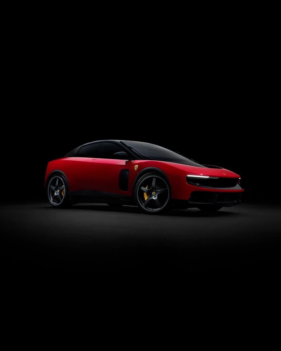
If you have been watching Ferrari with the attention usually reserved for architecture and tailoring, the Ferrari Luce lands like a considered pause. Designed in collaboration with Sir Jony Ive and Marc Newson at LoveFrom, developed with Ferrari Design Studio under Flavio Manzoni, it reads less like a flex and more like a decision. The headline is simplification, not austerity. Closed forms, pure shapes, a sculptural silhouette that feels carved rather than assembled.
There is a particular pleasure in a design that refuses to perform on command. Ferrari Luce does not beg you to notice every line, it asks you to register the whole. In an era when many new objects arrive dressed in noise, this one arrives in composure.
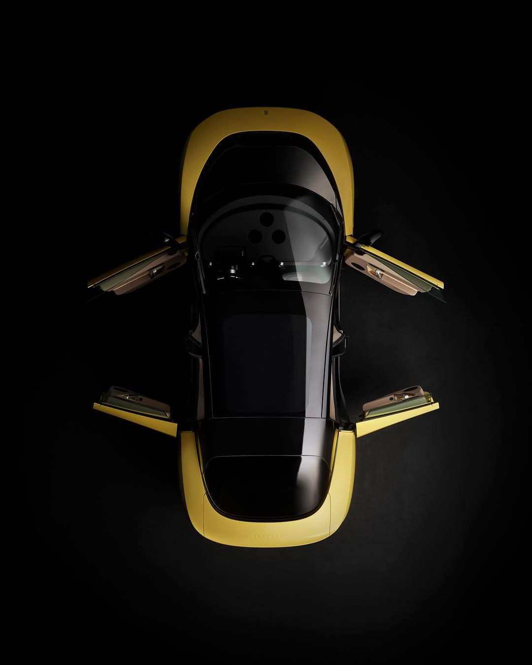
Ferrari Luce and the art of simplification
Simplification is a dangerous word in luxury. Too often it is used as a euphemism for subtraction without refinement. Here, it is closer to editing. You can feel the hands that are used to making decisions with consequence, the kind that leave nothing accidental. The styling cues recall closed forms and pure shapes, a geometry that feels almost serene, yet never meek.
What makes the Ferrari Luce compelling is not a single flourish but the discipline of the unified language. It is the visual equivalent of a beautifully weighted door, or the silence after a well timed final note. It has presence without chatter.
LoveFrom meets Maranello
Collaboration in design is often sold as novelty, but the best pairings are about shared values. LoveFrom has long been associated with obsessive restraint and tactility. Ferrari, at its best, has always understood proportion, the way sensuality can live inside precision. With Manzoni steering Ferrari Design, the studio has gradually moved toward a cleaner kind of drama. This project feels like that trajectory crystallised.
For readers who track Ferrari as culture as much as car, it is worth revisiting the brand’s own design point of view at Ferrari, and LoveFrom’s approach to craft at LoveFrom. Marc Newson’s long arc in industrial design is similarly well documented through his studio presence and museum footprint, with context often traced via institutions and press in the wider design world.
Rosso Fiammante and Giallo Luce, colour as character
Colour can either decorate a form or reveal it. In Rosso Fiammante, the surface reads like heat, a red with a sense of movement even when the object is still. It flatters the sculptural intent, making the closed forms feel intentional rather than sealed. In Giallo Luce, the story shifts. Yellow can be punishing, it exposes indecision. Here, it behaves like light, pulling edges forward, making the purity of the shape impossible to ignore.
These are not colours chosen to be photographed, although they will photograph beautifully. They are chosen because they clarify the design language. You see what is absent as much as what is present, and that is the point.
A unified design language, not a collage of references
There are plenty of contemporary designs that feel like mood boards made physical, a little of this, a quote from that, some retro for comfort. Ferrari Luce feels different. The cues are not pasted on, they are baked in. The closed forms and pure shapes do not read as nostalgia, they read as conviction.
It is the sort of object that invites slower looking. The eye follows the silhouette, then returns to it, because the satisfaction is in the whole. That is a rare pleasure in 2026, when attention is constantly being mined.
Why Ferrari Luce matters beyond the car world
Even if you do not keep a mental registry of Ferrari’s body language over decades, this debut is culturally legible. It sits comfortably in the same broader appetite that has made quiet, exacting luxury feel newly relevant, the preference for materials and proportion over obvious display. If you are drawn to that mood, our ongoing coverage in Luxury has been circling the same idea from fashion to interiors. The design conversation is also inseparable from the way we now treat cars as objects of taste, not just performance, and our Automobile pages follow that shift closely.
There is also a distinctly cultural story here. Ive and Newson come from a lineage where the best work feels inevitable, as if it could not have been otherwise. Ferrari comes from a lineage where desire is engineered, not merely hoped for. Watching those instincts converge is more interesting than any single headline quote. It suggests a future where the most persuasive luxury is the most edited.
Where to follow the design conversation
If you want the broader context of how design thinking travels between technology, objects, and mobility, Designboom remains a dependable read for the wider landscape, while Ferrari’s own channels offer the cleanest primary source view of its evolving language. And for the way this aesthetic resonates with the cultural temperature right now, our Culture coverage often catches the cross currents first.
Ultimately, Ferrari Luce is persuasive because it is not trying to persuade you in the usual way. It is simply there, complete, calm, and slightly confrontational in its refusal to decorate itself. That is what makes it feel new.
Photo Credits
Images courtesy of their respective owners.